Fall 2026 Trends: What To Design For Beyond Pumpkins & Leaves
Summer is coming in hot, which, if you’re a designer, means it’s probably time to start thinking about fall.
I know. It feels crazy to start thinking about fall in May, but if you design for products, fabric, wallpaper, stationery, home decor, or licensing, you’re usually working a season or two ahead. So while everyone else is thinking about pool days and iced coffee, we’re over here asking, “Okay, but what are people going to want on throw pillows in October?”
And when fall starts coming around, it is really easy to default to the obvious things: pumpkins, leaves, acorns, plaid. Maybe some mushrooms if we’re feeling adventurous.
And honestly, there is nothing wrong with any of that. A good pumpkin print can totally earn its place. But I do think there’s a bigger opportunity here, especially if you want your work to feel seasonal without feeling overly predictable, because fall trends are not really just about motifs. They’re about mood.
So, what are people craving? What colors are showing up in interiors and fashion? What kinds of textures, products, and spaces are people responding to? What kind of feeling do they want their homes, wardrobes, and gifts to have?
From what I’m seeing, the bigger direction for fall is warmth, texture, nostalgia, and personality. Things are feeling a little less stark and a lot more collected, cozy, expressive, and human.
Real Simple’s summary of the 2026 Houzz Emerging Trends Report points to a rise in cozy, old-world interiors, earthy colors like rust and chocolate brown, textured finishes like limewash and Venetian plaster, and nostalgic spaces like libraries and card rooms. (realsimple.com)
And for surface designers, that matters because we are not just making pretty repeats. We are designing the visual language that ends up on fabric, wallpaper, bedding, stationery, gift wrap, packaging, table linens, and all the little pieces that help a product feel like something.
So instead of asking, “What fall motifs should I draw?” I think a better question might be, “What kind of fall feeling am I designing for?”
Earthy color, but richer
Fall color is always warm in some way, but I would not only be thinking about bright orange and golden yellow. I would be thinking about rust, cocoa, clay, olive, mushroom, cream, muted saffron, dusty blue, deep green, plum, and patina blue.
Houzz reported that searches for “rust colors” were up 178%, while “chocolate brown” climbed 153%, and softer earthy neutrals like mushroom, sage, taupe, and cream were also rising. (houzz.com)
That tells me people are not just looking for color. They are looking for grounded color. Colors that feel warm, layered, natural, and livable.
For surface design, that means a fall collection does not have to use the first autumn palette that comes to mind. A woodland collection in chocolate, cream, olive, and dusty blue could still feel seasonal. A floral collection in plum, espresso, rust, and antique gold could feel fall-ready without including a single pumpkin. Even kids’ prints can lean into earthier colors so they still feel playful, but beautiful enough for parents to want in their homes.
A trend does not have to become your whole style. Sometimes it is just a color shift.
Texture is part of the appeal
One of the biggest things I noticed while researching fall and 2026 trend directions is that texture is not just a background detail anymore. It is becoming part of what people are responding to.
Etsy named Patina Blue its 2026 Color of the Year, but what stood out to me even more is that they also named Washed Linen as their first-ever Texture of the Year. Etsy describes it as soft, relaxed, lived-in, and full of subtle tonal variation. (etsy.com)
That is really interesting for surface designers because it points to work that feels tactile, aged, softened, and not too perfect.
The same thing is showing up in interiors, with rising interest in sandstone, linen wallpaper, limewash, Venetian plaster, and terracotta flooring. (realsimple.com)
For us, that could mean linen overlays, chalky texture, pencil grain, imperfect ink edges, block-print-inspired shapes, speckled grounds, woven-looking stripes, faded florals, watercolor blooms, or painterly brush marks.
Not messy, necessarily. Just less flat and digital than in past years. Especially if you design digitally, texture can help a pattern feel more like it belongs on a real product instead of just sitting perfectly on a screen.
Moody botanicals instead of basic fall leaves
If you want a fall collection to feel a little more elevated, moody botanicals are probably a more interesting direction than just repeating maple leaves in orange and yellow.
Patternbank’s AW 26/27 Première Vision trend report identified several directions that fit this mood really well, including Botanical Haze, Painterly Florals, Midnight Flora, and Interlocking Geometry. (patternbank.com)
That kind of language points toward florals and botanicals that feel painterly, layered, atmospheric, and a little more sophisticated.
So instead of literal fall leaves, you might think about dark garden florals, tangled vines, berry branches, shadowy foliage, faded bouquets, antique florals, pressed flowers, mushrooms tucked into botanicals, or little woodland details worked into a more layered print.
A floral on cream might feel springy. That same floral on espresso, plum, charcoal green, or deep blue can suddenly feel like fall.
That is the part that matters. Seasonal design does not always come from the motif itself. Sometimes it comes from the way the motif is handled.
Heritage, handmade, and collected details
Another direction I would pay attention to is the return of heritage-inspired design.
TrendBible pointed to stripes, checks, plaids, florals, botanicals, geometrics, and spots as perennial print trends for 2026, especially in home and kids ranges. (trendbible.com) And Better Homes & Gardens recently covered the “eccentric aunt” aesthetic, which is basically a warmer, more personal version of maximalism, with vintage finds, layered patterns, quirky details, embellishments, and a collected-over-time feeling. (bhg.com)
For fall, that feels very relevant. Fall is naturally connected to home, gathering, nesting, baking, sewing, gifting, and returning indoors, so patterns with a handmade or heritage feeling make a lot of sense, especially for fabric, wallpaper, table linens, tea towels, stationery, wrapping paper, and home decor.
That might look like quilt-inspired coordinates, hand-drawn checks, primitive stars, folk birds, sampler-style florals, woven stripes, blocky geometrics, small calico florals, or simple repeating icons that feel like they came from an old textile but still work in a modern collection.
The key is not to turn it into a costume. You don’t have to make something that looks like it came straight out of a museum. But you can take the warmth, structure, and handmade feeling of older textiles and translate it through your own style.
Maybe that just means using softer colors with cleaner motifs, more playful animals, a more modern palette, or a slightly whimsical layout. That is where it starts to feel current instead of copied.
Paper goods and nostalgic details are worth watching
This one may not feel like an obvious fall trend at first, but I think it has a lot of potential.
Pinterest’s 2026 Predicts report includes a “Pen Pals” trend, with growing interest in old-fashioned snail mail, elaborate envelopes, special stationery, cute stamps, handwritten letters, pen pal letters, and snail mail gifts. (business.pinterest.com)
And actually, that feels super fall to me.
When the weather changes and people start spending more time inside, paper goods make sense. Stationery, cards, gift wrap, tags, stickers, planner pages, journals, calendars, recipe cards, thank-you notes, packaging, and printable products all fit naturally into that slower, cozier, more nostalgic mood.
From a surface design perspective, this could become a really charming direction.
Consider stamps, envelopes, postmarks, handwritten marks, bows, wax seals, little frames, labels, florals, tiny icons, bookish motifs, tea cups, candles, desks, fountain pens, or little decorative borders.
Those ideas still feel seasonal because they connect to the feeling of fall, not just the symbols of fall.
Blue might make fall feel fresher
Blue is not usually the first color people think of for fall, but I would not ignore it.
Pinterest’s “Cool Blue” trend points to icy blue showing up across mood boards, weddings, menus, makeup, and broader visual culture. (create.pinterest.com) Etsy’s Patina Blue also supports blue as a major 2026 color direction. (etsy.com)
For fall, I would probably soften it into maybe a dusty blue, slate blue, denim blue, smoky blue, or patina blue paired with rust, cream, olive, plum, or chocolate brown.
Blue can make a fall palette feel less expected, which is often exactly what makes it more interesting.
So what should we actually design for fall?
I personally do not think the answer is to chase every trend.
That is usually where trend research gets overwhelming. You look at all the colors and motifs and aesthetics floating around, and suddenly it feels like you need to design a moody botanical, a folk collection, a blue stationery line, a dark floral, a quilt print, and somehow make it all fit your brand by next Tuesday.
That isn’t the point. The point is to notice where buyer taste is moving, and then translate that through your own visual language.
For fall, I would be thinking about collections that feel warm but not necessarily orange, nostalgic but not dated, textured but not messy, playful but still usable, seasonal but not overly literal, and collected but still cohesive.
And I would be asking things like: could this work on fabric, wallpaper, stationery, gift wrap, or table linens? Does the collection have enough quiet pieces to support the statement print? Does the palette feel current, or does it feel like the first fall palette that came to mind? Is this actually aligned with my style, or am I just chasing a trend because I saw it on a list?
Because that is really the balance.
Trends can be useful. They can give us language for what people are responding to, and they can help us spot opportunities we might not have thought about yet. But they should not override our point of view.
A stronger approach is to take the trend signal and filter it through your own work. Maybe you design a moody floral, but it still has your playful shape language. Maybe you use rust and chocolate brown, but add dusty blue because that feels more like you. Maybe you create a heritage-inspired collection, but instead of going serious and traditional, you make it softer, sweeter, or more whimsical.
That is where good trend translation happens.
Not copying what is trending. Not ignoring trends entirely. Just noticing the direction things are moving, and then asking, “How would this live in my world?”
For fall, I think the biggest opportunity is to move beyond the obvious seasonal symbols and design into the deeper feeling of the season: warmth, texture, nostalgia, home, story, gathering, softness, and a little bit of richness.
Pumpkins and leaves can absolutely still have a place. But they don’t have to be the whole story.
Until next time
Need help to stay ahead of schedule with your seasonal designs?
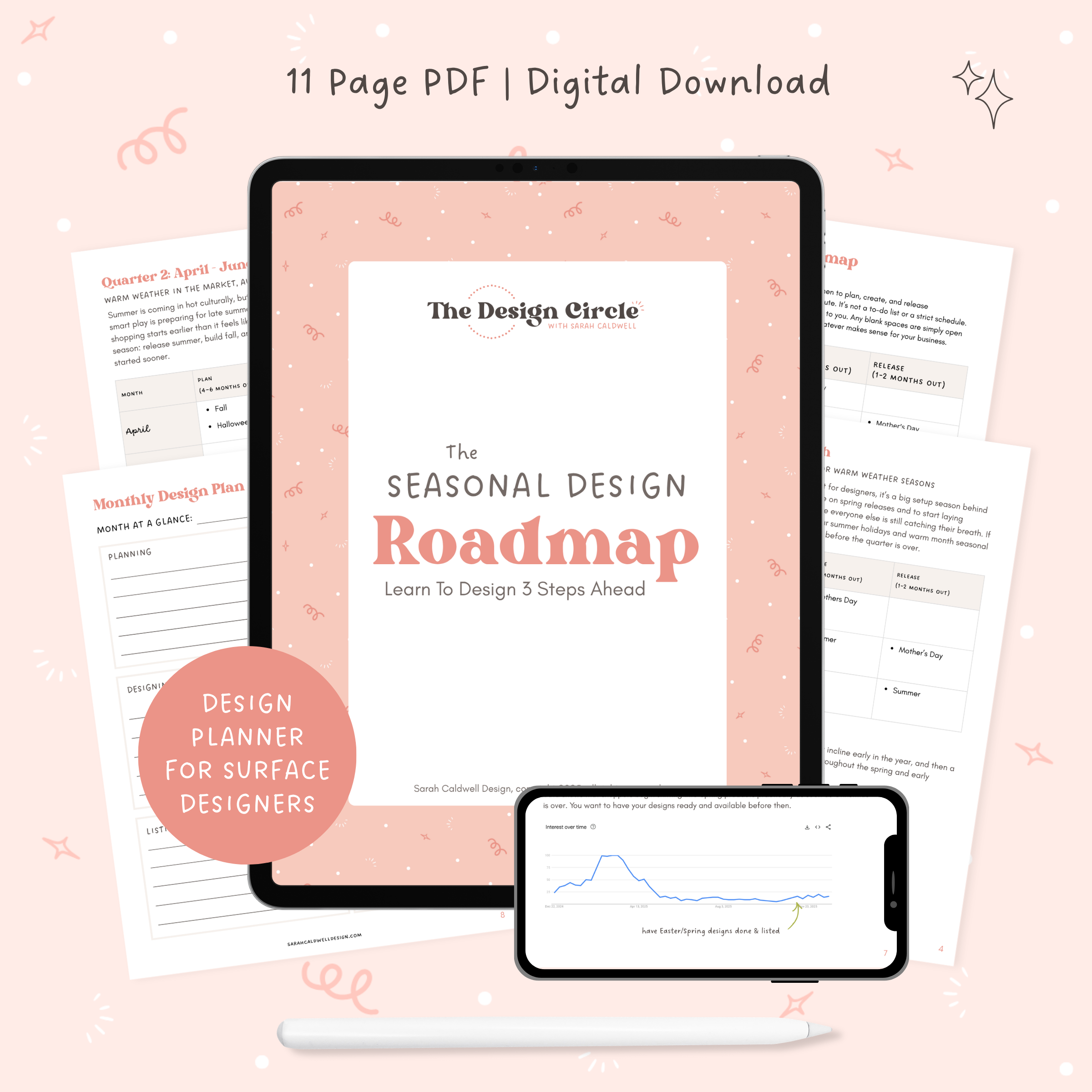
If you feel like you’re always behind and struggling to release work before it’s seasonally relevant, I made The Seasonal Design Roadmap for you.
I did the Google Trends research for you and identified the best times to plan, create, and release collections so they're ready for designers and makers when they start searching.
Then, I put together this quick guide to keep you on track throughout the year based on the search insights I discovered.