Pretty Patterns Are Great, But What Product Are They For?
Surface pattern design is kind of funny because the whole point is right there in the name: we are designing patterns for surfaces.
Not just to end up as pretty little squares in the digital void forever, even though, yes, sometimes that is where they sit for a while. We are designing patterns because we want them to eventually be used on something. We want someone to want the artwork on a bed set, a pajama set, a beautiful blouse or dress, wallpaper in their living room, a baby blanket, a phone case, a journal cover, fabric by the yard, wrapping paper, whatever.
So if the end goal of surface design is literally to have our artwork printed onto a surface, then don’t you think it makes sense to consider what those surfaces might be before we start drawing?
When you have even a loose idea of where the artwork could live, you start making stronger design decisions from the beginning.
And I do want to say, I enjoy a bit of spontaneity in my artwork as much as the next person. I am not saying every collection needs to be planned within an inch of its life before you ever make a mark. Sometimes you start with a color palette, or a motif, or some weird little idea that won’t leave you alone, and you follow it because that is part of what keeps the work fun and alive. But generally speaking, I do think it’s a good idea to at least think about the end product before you start designing. Even if that product category is loose. Even if it’s just “this might be a bedding set,” or “this could be really cute for girls’ swimwear,” or “I could imagine it in a nursery,” or “I’m going for wallpaper.”
That little bit of direction can impact your design decisions and make your collection stronger overall.
Product direction changes the design decisions
If I know I’m designing with swimwear in mind, for example, I’m probably going to make different choices than I would if I were designing for wallpaper, bedding, or stationery. The motifs might be different, sure, but even beyond that, the scale, the contrast, the amount of detail, the types of coordinates, and the balance between bold and quiet prints might all shift.
Also, a swim collection probably needs a different kind of energy than a bedding collection. A wallpaper collection might need a different sense of movement than a pajama collection. A phone case or journal cover might be able to handle a tighter, busier print in a way that a duvet cover may not.
And, this does not mean one collection can only ever be used on one type of product. Obviously not. Patterns are typically quite flexible, and sometimes they surprise you in their versatility. But choosing a general product direction gives the collection a design problem to solve, and I think that is incredibly helpful.
I recently mocked up one of my collections as a little swim line, and it immediately made the whole thing feel clearer to me. Not because the art changed, but because I could suddenly see the patterns doing different jobs.
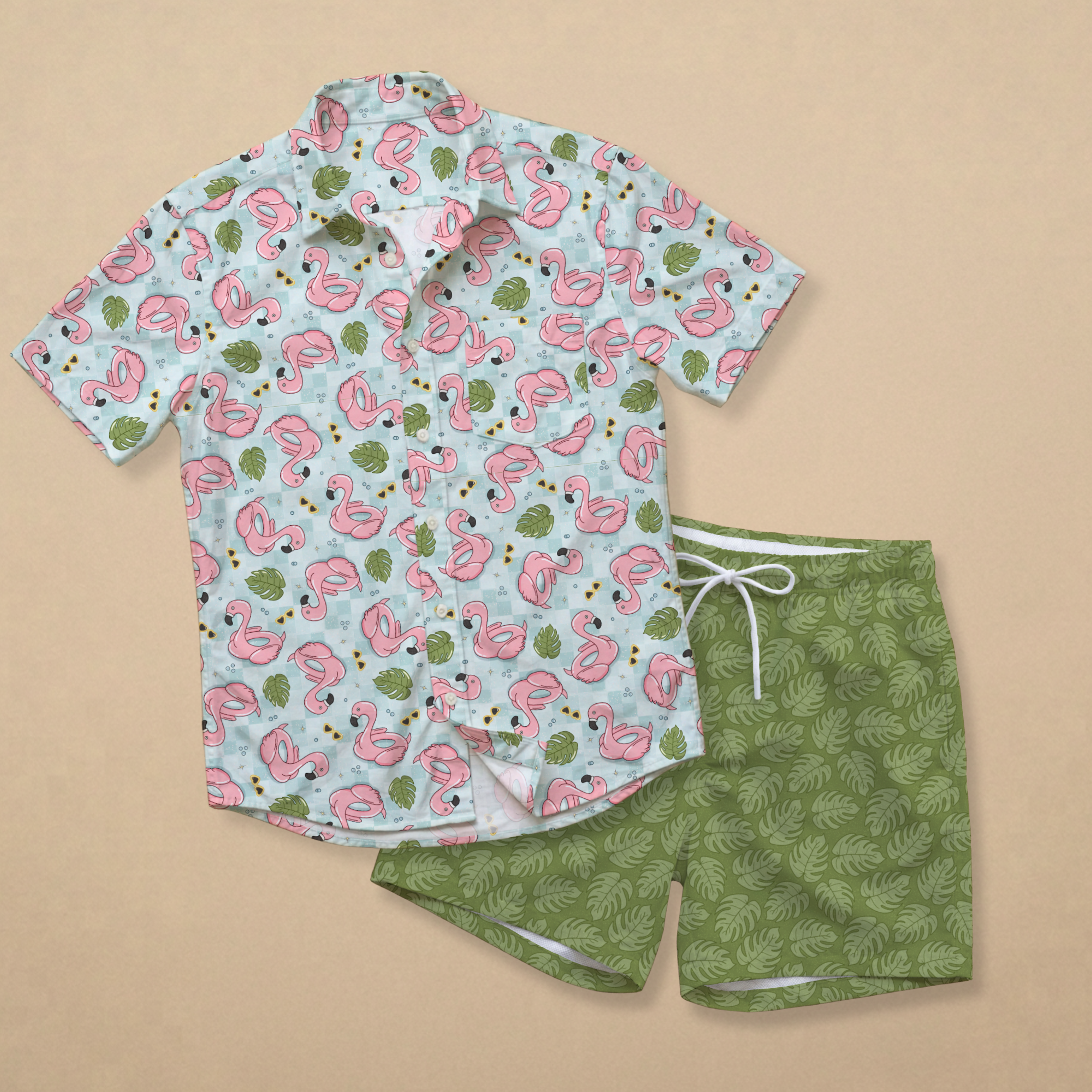
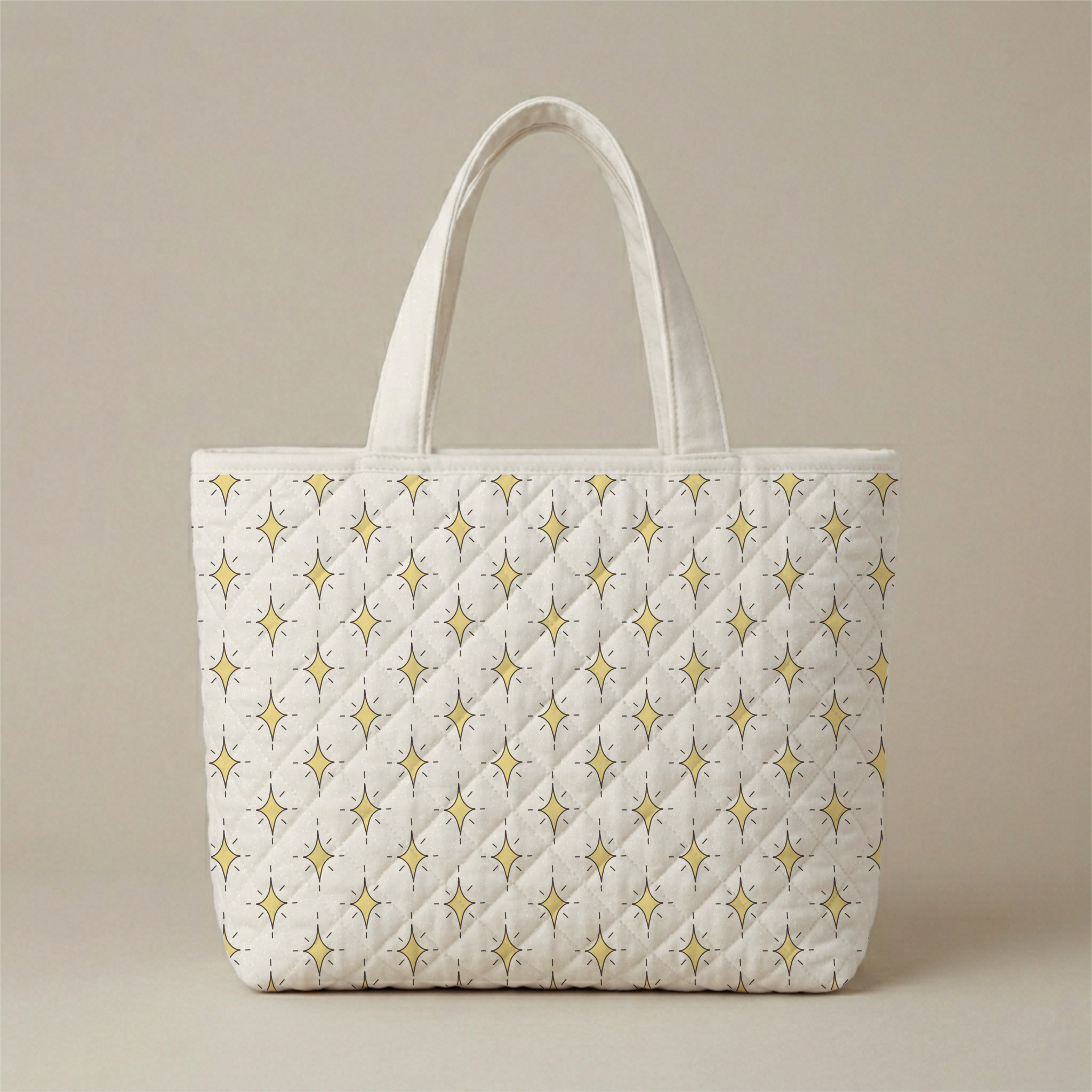
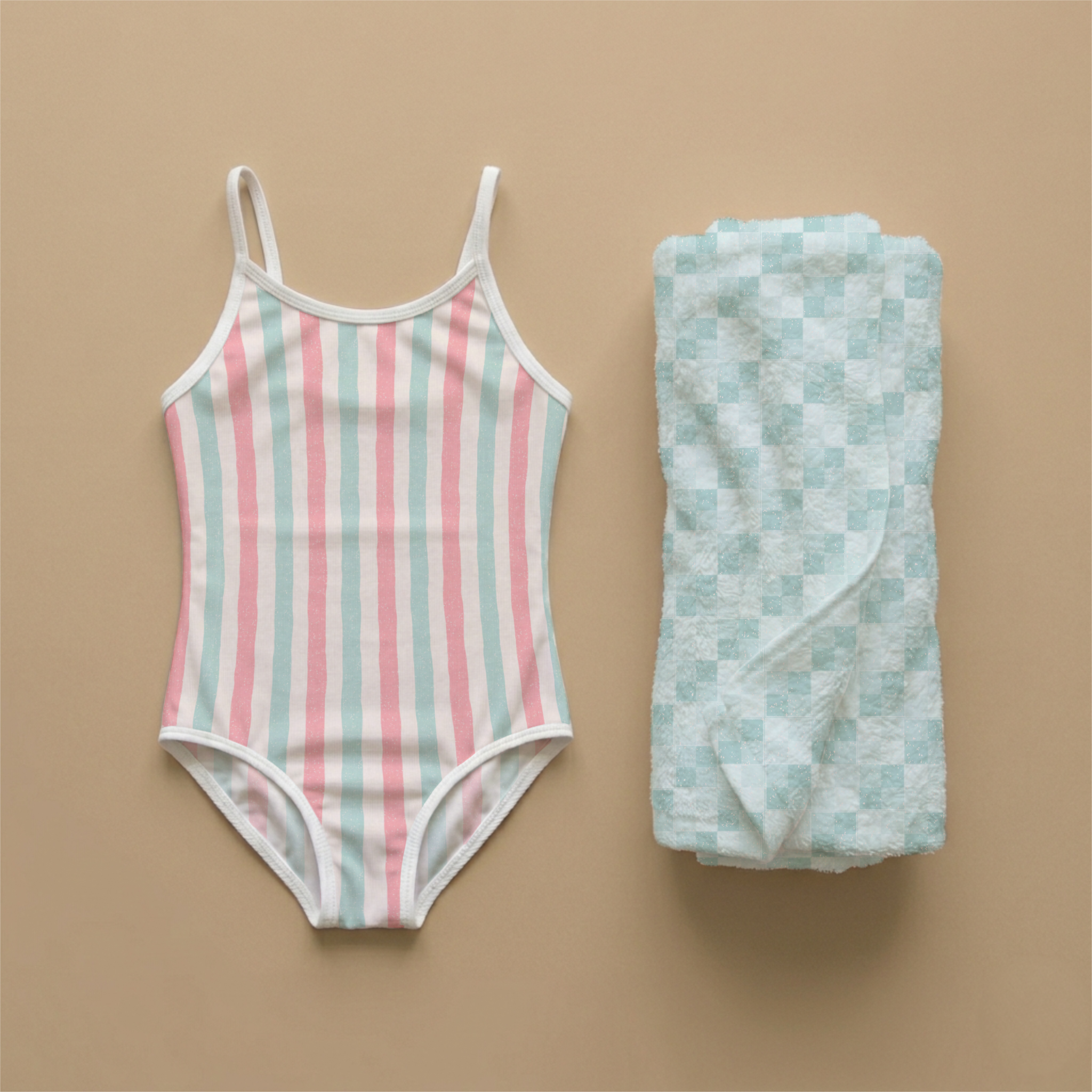
The flamingo floaty print is the fun statement piece. The monstera toss is a great clean secondary. The coordinating pieces could work on accessories, towels, bags, accents, or places where the hero print would just be too much.
And looking at it that way made the whole collection make more sense.
Because if I’m thinking, “This could become a swim/summerwear line,” then I’m not just asking, “What cute pool party motifs can I draw?” I’m asking, “What does this line actually need in order to feel usable?” “What types of patterns look best on small pieces of fabric as bathing suits?” “Which would look best on towels or beach bags, etc.”
And these are different questions.
It pushes you beyond making another pattern just because the motif is cute, and it helps you start thinking about roles. What needs a bold pattern? What needs something subtler? What could work on the main product? What about accent pieces? What print gives the eye a break? What print adds structure?
Because a print might be beautiful on its own, but once it is part of a collection, it has a job to do.
Every pattern needs a job
Some patterns are there to carry the story, some are there to support the hero, some add rhythm, some add movement, some make the whole collection just feel more practical and usable. And some are honestly just there to be a team player, which sounds boring until you realize those are often the prints that make the collection actually work.
I think this is why a collection can have five or six lovely patterns and still feel a little off. I don’t think it’s usually because the art is bad. Often, the art is beautiful, but all the patterns are accidentally trying to fill the same role, so create chaos and confusion when a brand or maker wants to use them on their products.
That’s why I like thinking about the end product use before I get too far into a collection. It gives the collection a reason to have variety.
If I’m imagining a swim collection, I’m not only asking, “Do these patterns look good together?” I’m asking, “Which ones could be the main swimsuit prints? Which might make sense as a matching towel? Which one could work as a great cover-up? Which one could be trim, lining, maybe flip flops, a scrunchie, a beach bag, a wet bag, or some other secondary piece?”
Those questions make the design decisions clearer, because now I’m not just making another coordinate for the sake of filling out the collection. I’m making a print that has a purpose and a specific product in mind.
And no, you don’t have to design every pattern around a specific product line. I definitely don’t think your design needs to be that rigid, and I also don’t think every pattern collection has to be locked into one use forever.
But, at some point, and ideally sooner rather than later, I do think it helps to ask what kind of product world the collection belongs in.
Because a collection designed with baby bedding in mind might need a totally different rhythm than a collection designed for women’s swimwear. A collection for wallpaper might need a different kind of scale and movement than one intended for kids’ pajamas. A collection for stationery might need different focal points than one meant for fabric.
The product does not have to control every decision, but it can guide them. And I think that distinction matters.
You are not removing creativity
Before you start thinking that choosing an end product will limit your design… You are not removing creativity by thinking about product use - you are giving the creativity somewhere to go.
That’s really the difference between just making art and thinking like a designer in this context. The art might start with what you want to draw, what feels inspiring, what colors you love, and what motifs keep showing up in your sketchbook. But the design side asks how those pieces function together and where they might actually live. Because if your goal is to license your work, sell patterns, create fabric collections, or present your portfolio professionally, then product use matters.
It just does.
A hero print can be gorgeous, but if every other print is also screaming for attention, the hero is not really the hero anymore. A coordinate can be simple, but if it creates balance and makes the hero print more usable, that simplicity is doing real work.
This is also why I think “cohesive” does not have to mean everything looks the same. In fact, I think a collection usually gets stronger when the pieces are related but not identical.
Same world, different jobs. Same mood, different energy. Same palette, different scale. Same story, different moments.
That is usually what makes a collection feel like something that could actually become a real product line instead of just a set of matching patterns.
So before you start your next collection…
So before you start your next collection, or at least very early in the process, I would strongly recommend you ask yourself: what is this collection for?
Is it for bedding? Swimwear? Kids’ apparel? Wallpaper? Paper goods? Fabric? Baby products? Home decor?
You do not need a perfect answer, and you can absolutely change your mind as the collection develops. But even a loose answer can give you some helpful direction. And once you have that product direction, the next questions become a lot more useful.
What is the main statement print? What is supporting it? What gives the eye a break? What adds structure? What adds movement? What would work at a smaller scale? What would actually make sense on the products I’m imagining?
And maybe the bigger question: if this collection became a real line of products, would every pattern have a reason to exist and an obvious place for it to be used?
Once you start thinking that way, you stop building collections by just adding more and more patterns, hoping the collection eventually feels complete, and instead you start designing with more intention. You can look at the collection and easily see what is missing or where there is crowding.
This is really the heart of what I teach inside The Pattern Collection System.
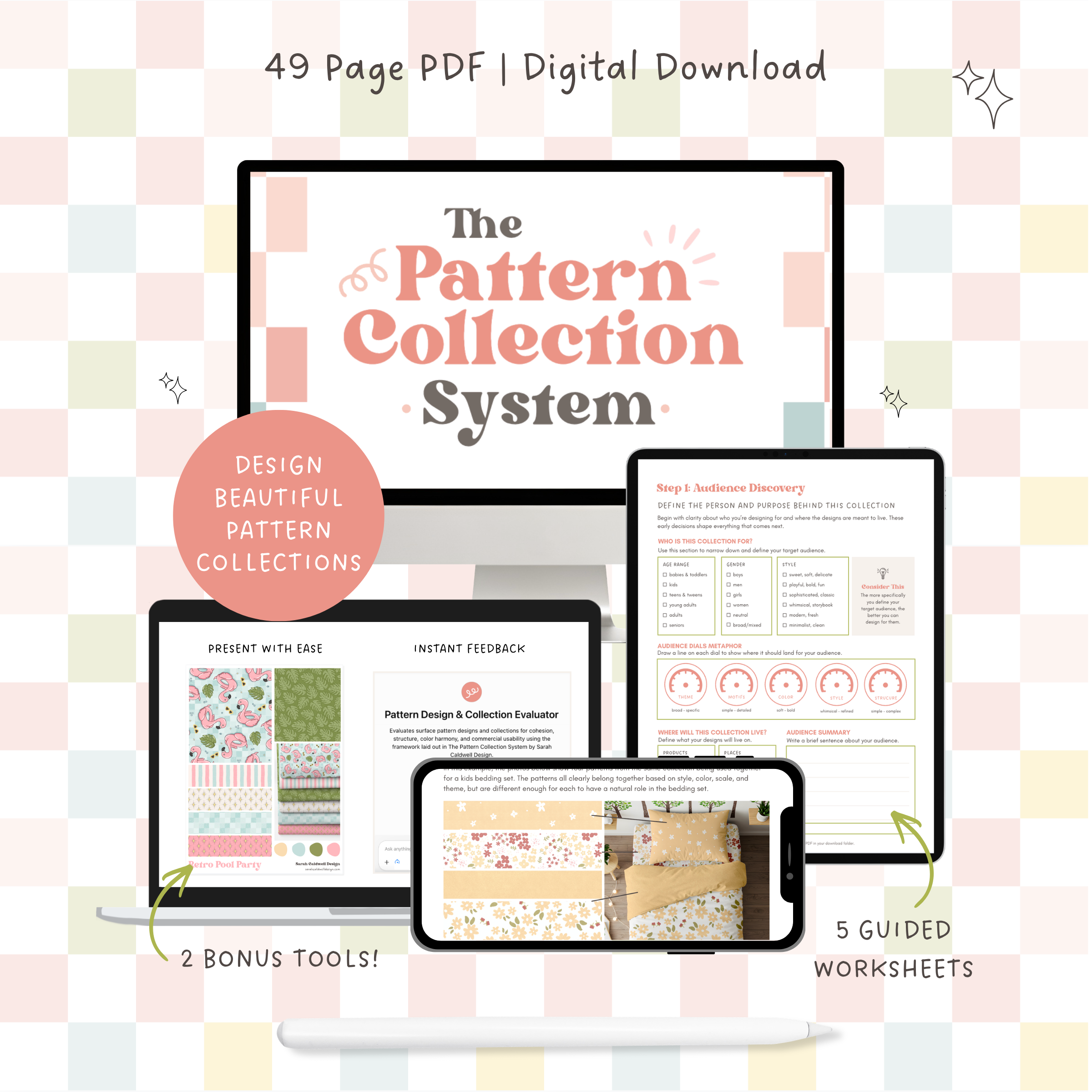
The Pattern Collection System is a guided workbook for surface designers who want to stop making one-off patterns and start building intentional collections that art directors want.
Have you ever created individual patterns you love, but then struggled to turn them into a collection that actually works together?
I’m willing to bet you don’t need another drawing course… you need a stronger foundation in design.
This workbook is about learning how to think like a designer: how color, layout, scale, and spacing work together. How each pattern plays a role within a collection and its end use. How to make intentional choices instead of just guessing.
Because strong collections aren’t just drawn — they’re designed.
Inside the Workbook You’ll Learn to:
Turn a broad theme into a clear, developed concept
Make intentional motif choices that support your concept (not just what feels right)
Build color palettes that feel natural and harmonious across a collection
Understand what each pattern is for — and how it’s used in real products
Create variation through scale, density, and flow
Finish a body of work that works
What’s Included in The Pattern Collection System:
49-page workbook with 3 units on Strategy, Design, and Presentation
4 guided planning worksheets + 1 cohesion checklist
2 Quick Reference Guides on color & design decisions
AI Pattern & Collection Evaluator tool for clear, structured feedback — anytime you need it
5 Canva sell sheet templates to help you present your collections for licensing
The Pattern Collection System is for designers ready to move beyond one-off patterns and start designing intentional collections. It is not instructional on illustration, style, software, or selling/licensing. It is best suited for designers who already understand the basics of repeating patterns.
It is about learning how to think through a collection like a designer, so you can make stronger decisions before you get too far into the artwork.
Inside The Pattern Collection System, we look at things like theme, audience, product use, hierarchy, scale, contrast, flow, and presentation, because all of those pieces affect whether a collection feels complete and usable on real products.
Because pretty patterns are wonderful. I love me some pretty patterns. But when you can take those pretty patterns and start thinking about what they are for, how they work together, how they support each other, how they could actually live on products, and how the whole collection functions as a system?
That is when the work starts to feel much stronger.
If you are ready to get more intentional with your collections, The Pattern Collection System walks you through the full process of planning, designing, and presenting pattern collections with more clarity and purpose.
You can check it out here: